
This is my responsive portfolio site for my web designer and developer career.
- Live Here - Click the link to see the site.
I have written out the guiding ideas and principles I had in mind when creating this site.
I wrote the original homepage in English. As I'm based in Tokyo, I translated the site by myself into Japanese.
I use CSS Grid to arrange the content into columns. Then I use media queries to change font sizes and columns so it looks good on any device.
For example,
/* Extra large devices (large laptops and desktops, 1200px and up) */
@media only screen and (min-width: 1200px) {
  body {
    font-size: 25px;
}I use HTML5 semantic tags to show the content clearly according to W3C standards.
<header></header>
<main></main>
<content></content>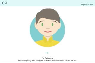
<footer></footer>I include alt attributes for images for users with different accessibility requirements (like using screen readers).
<img id="profile-pic" src="img/becky-357x414.png" alt="A cartoon illustration of Rebecca">I used FontAwesome for the social media logos and other icons because it is kept up to date and it is a font - which makes resizing and coloring with CSS easy. It is supported by all browsers and it only takes a single HTTP request to load all of the font characters, so it is quicker than individual image files.
- FontAwesome - For social media logos