Plotly is a Python library which is used to design graphs, especially interactive graphs. It can plot various graphs and charts like histogram, barplot, boxplot, spreadplot and many more. It is mainly used in data analysis as well as financial analysis. plotly is an interactive visualization library.
Box Plot
A box plot is a demographic representation of numerical data through their quartiles. The end and upper quartiles are represented in box, while the median (second quartile) is notable by a line inside the box. Plotly.express is convenient,high-ranked interface to plotly which operates on variety of data and produce a easy-to-style figure.Box are much beneficial for comparing the groups of data. Box plot divide approx. 25% of section data into sets which helps ion quickly identifying values, the dispersion of the data set, and signs of skewness.
Syntax: plotly.express.box(data_frame=None, x=None, y=None, color=None, facet_row=None, facet_col=None, facet_col_wrap=0, hover_name=None, hover_data=None, custom_data=None, animation_frame=None, animation_group=None, category_orders={}, labels={}, color_discrete_sequence=None, color_discrete_map={}, orientation=None, boxmode=None, log_x=False, log_y=False, range_x=None, range_y=None, points=None, notched=False, title=None, template=None, width=None, height=None)
Parameters:
Example 1: Using Iris Dataset
import plotly.express as px

df = px.data.iris()

fig = px.box(df, x="sepal_width", y="sepal_length")

fig.show()
Output:

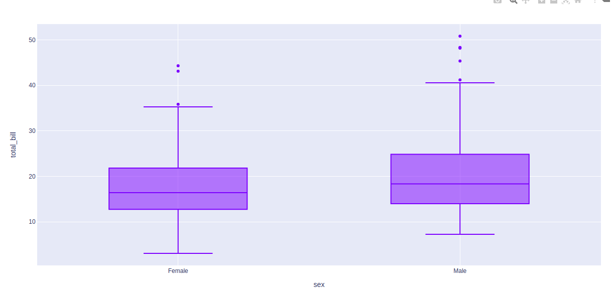
Example 2: Using Tips Dataset
import plotly.express as px

df = px.data.tips()

fig = px.box(df, x = "sex", y="total_bill")
fig.show()
Output:
In the above examples, let’s take the first box plot of the figure and understand these statistical things:
- Bottom horizontal line of box plot is minimum value
- First horizontal line of rectangle shape of box plot is First quartile or 25%
- Second horizontal line of rectangle shape of box plot is Second quartile or 50% or median.
- Third horizontal line of rectangle shape of box plot is third quartile or 75%
- Top horizontal line of rectangle shape of box plot is maximum value.
- Small diamond shape of blue box plot is outlier data or erroneous data.
Changing Algorithm for Quartiles
The algorithm to choose quartiles can also be selected in plotly. It is computed by using linear algorithm by default. However, it provides two more algorithms for doing the same i.e. inclusive and exclusive.
Example 1: Using inclusive algorithm
import plotly.express as px

df = px.data.tips()

fig = px.box(df, x = "sex", y="total_bill", points="all")
fig.update_traces(quartilemethod="inclusive")

fig.show()
Output:
Example 2: Using exclusive algorithm
import plotly.express as px

df = px.data.tips()

fig = px.box(df, x = "sex", y="total_bill", points="all")
fig.update_traces(quartilemethod="exclusive")

fig.show()
Output:

Showing the underlying data
Underlying data can be shows using the points arguments. The value of this argument can be of three types -
- all for all points
- outliers for outliers only
- false for none of the above
Example 1: Passing all as argument
import plotly.express as px

df = px.data.tips()

fig = px.box(df, x = "sex", y="total_bill", points="all")
fig.show()
Output:
Example 2:
import plotly.express as px

df = px.data.tips()

fig = px.box(df, x = "sex", y="total_bill", points="outliers")
fig.show()
Output:
Styling box plot
Boxplot comes with various styling options. Let's see one such option in the below example.
Example:
import plotly.express as px

df = px.data.tips()

fig = px.box(df, x = "sex", y="total_bill", points="all", notched=True)
fig.update_traces(quartilemethod="exclusive")

fig.show()
Output: